Red Bay Basque Whaling Station

Red Bay Basque Whaling Station

US$0.00

Aligning promise to experience

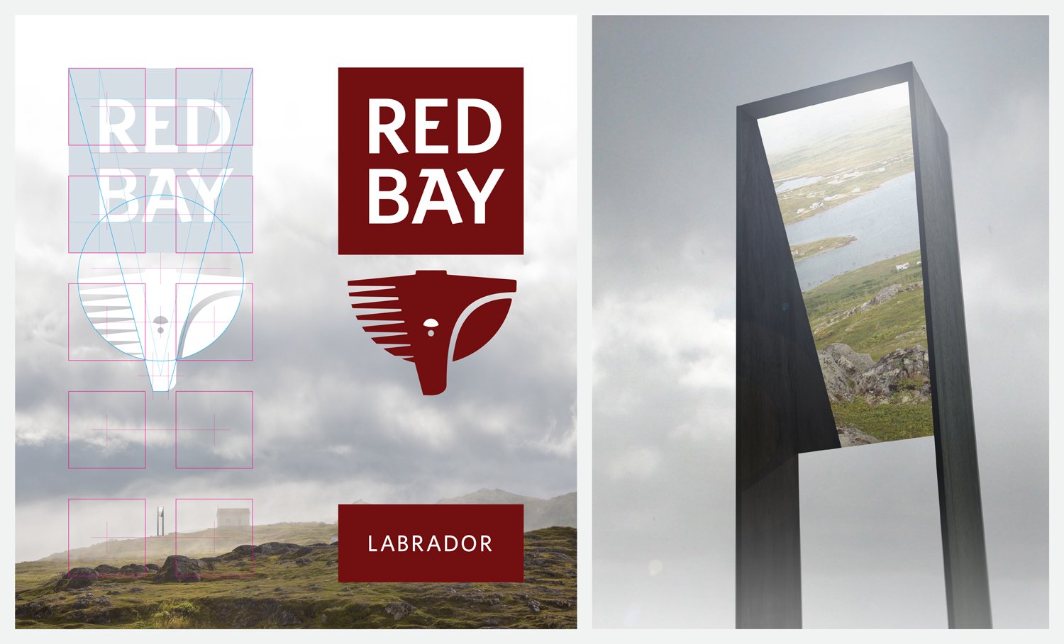
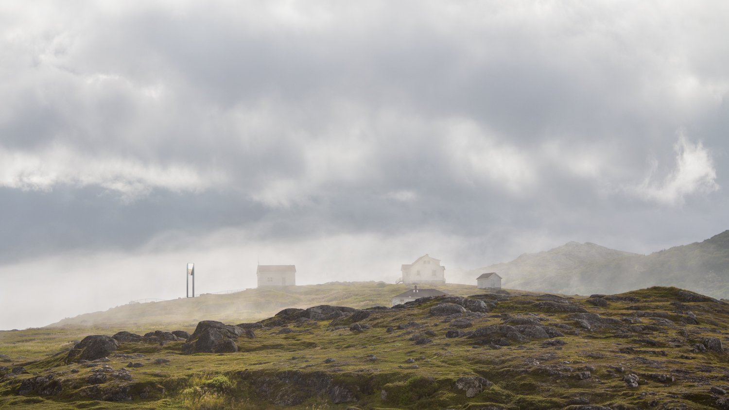
Red Bay is a modern fishing village, but with a surprising history: it was the site of a vast 16th century industrial Basque whaling operation, largely unknown until the 1970s.

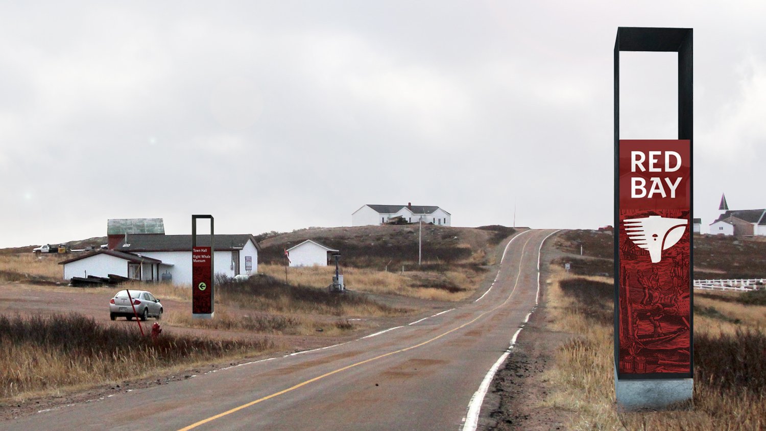
After producing Red Bay's visitor experience manual (with partner Susan MacLeod), we were asked to build a brand for Red Bay that would work in harmony with associated brands such as Newfoundland and Labrador, Destination Labrador, Parks Canada, and UNESCO.

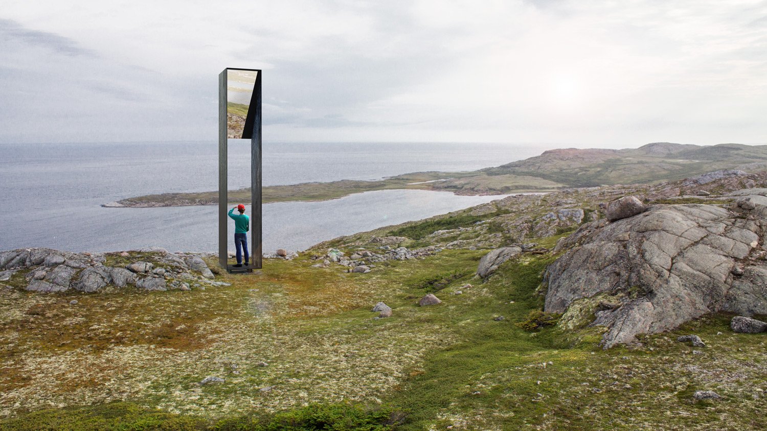
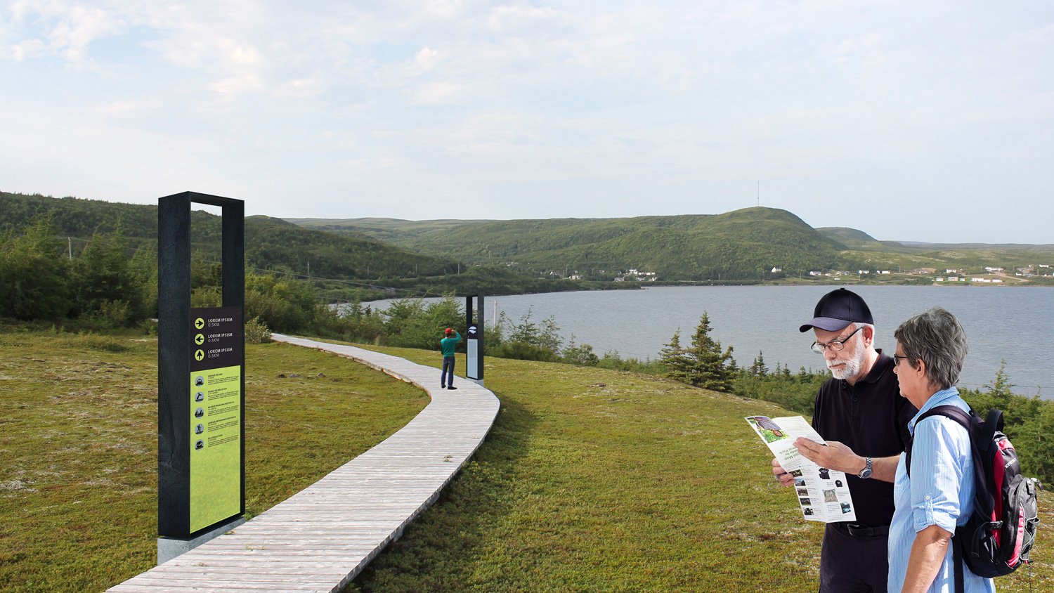
Our place branding addresses the lack of visible heritage with a subtle piece of signature architecture—the “monument”—that encourages today’s visitors to contemplate 16th century whaling lookouts. All brand elements (logo, signage, graphics, and colours) are based on the monument's form.

Status

2013–14 (visitor experience master plan)
2015–16 (brand and wayfinding)

Our Role

Brand, architecture, wayfinding, landscape architecture

Client

Red Bay Basque Whaling Station World UNESCO Heritage Site

Location

Red Bay, Labrador

Add To Cart
THE RED BAY BRAND In Red Bay, the brand and the built environment are inextricably linked.

THE RED BAY BRAND
In Red Bay, the brand and the built environment are inextricably linked.

ENGRAVING We use a modified 16th century woodcut, mixed with photographs of the current Red Bay landscape, in order to promise an experience which can actually be delivered: indoor interpretation with outdoor adventure.

ENGRAVING
We use a modified 16th century woodcut, mixed with photographs of the current Red Bay landscape, in order to promise an experience which can actually be delivered: indoor interpretation with outdoor adventure.

THE MONUMENT At the centre of the Red Bay sign system is the "monument", relating to observation posts used by Basque sailors to spot whales coming through the Strait of Belle Isle. The monument is built as a piece of signature architecture; it is a…

THE MONUMENT
At the centre of the Red Bay sign system is the "monument", relating to observation posts used by Basque sailors to spot whales coming through the Strait of Belle Isle. The monument is built as a piece of signature architecture; it is as important as other brand assets (e.g. logo, colour scheme), to be prominently shown in photographs and best seen in person.
The large monument is reflective, a highly visible beacon placed in Red Bay's sparse environment—a signature structure, intended to be seen in photographs and to contribute to Red Bay's destination promise,

MONUMENT These monuments, made of steel and painted black, evoke plumes of dark smoke which would have wafted from the tryworks where whale blubber was rendered into lamp oil. The monuments also echo the dark oily skin of the right and bowhead whale.

MONUMENT
These monuments, made of steel and painted black, evoke plumes of dark smoke which would have wafted from the tryworks where whale blubber was rendered into lamp oil. The monuments also echo the dark oily skin of the right and bowhead whale.

PROPORTION From the logotype to monument, a common set of proportions was developed to maintain consistency across the brand.

PROPORTION
From the logotype to monument, a common set of proportions was developed to maintain consistency across the brand.

STAYING TRUE TO THE PROMISEThere is a disconnect between the promise of a 16th century Basque whaling station and the current town of Red Bay, mostly built in the mid-20th century. Visitors to Red Bay will largely experience the latter, while interp…

STAYING TRUE TO THE PROMISE

There is a disconnect between the promise of a 16th century Basque whaling station and the current town of Red Bay, mostly built in the mid-20th century. Visitors to Red Bay will largely experience the latter, while interpreting the former; we must be cautious in how Red Bay is represented.

INFLUENCES The logo for Red Bay Basque Whaling Station is constructed of several symbols: a contemporary take on historical Red Bay references and inspired by the place itself.

INFLUENCES
The logo for Red Bay Basque Whaling Station is constructed of several symbols: a contemporary take on historical Red Bay references and inspired by the place itself.

OBSERVING THE NATURAL SETTING The palette is informed by the landscape and flora of Red Bay, along with common Basque colours. Reds and greens are dominant, from plants common to the area. Colour subtly builds a sense of place when it associates wit…

OBSERVING THE NATURAL SETTING
The palette is informed by the landscape and flora of Red Bay, along with common Basque colours. Reds and greens are dominant, from plants common to the area. Colour subtly builds a sense of place when it associates with the environment.
The colour palette includes: Red Bay (red), Belle Isle (Blue); Caribou Lichen; Moss, Partridge Berry, Bakeapple, Wild Blueberry, Squash Berry, and New Leaf.

BASQUE CULTURE Though Basque influence on present-day Red Bay is non-existent, the unique Roman-inflected style of Basque typography informed our typeface choices for this brand. Tyepfaces include Whitney, and Carter Sans.

BASQUE CULTURE
Though Basque influence on present-day Red Bay is non-existent, the unique Roman-inflected style of Basque typography informed our typeface choices for this brand. Tyepfaces include Whitney, and Carter Sans.

A UNIFYING FORM In this system, a single metaphor (the “portal”) and a unifying set of proportions guides the form of everything, including the Red Bay logo, the shape of the monument, and the form of all signs in the system.

A UNIFYING FORM
In this system, a single metaphor (the “portal”) and a unifying set of proportions guides the form of everything, including the Red Bay logo, the shape of the monument, and the form of all signs in the system.

SYMBOLS A few custom symbols have been designed to subtly amalgamate past and present. Ships are represented by a silhouette of a galleon; the two oarsmen could be Basque sailors or present-day visitors; and the hiker wears a historical pack.

SYMBOLS
A few custom symbols have been designed to subtly amalgamate past and present.
Ships are represented by a silhouette of a galleon; the two oarsmen could be Basque sailors or present-day visitors; and the hiker wears a historical pack.

GATEWAY AND MAJOR IDENTIFICATION SIGN This gateway / ID sign welcomes visitors to the town, and identifies major destinations at a vehicular scale. On the reverse side, pedestrian-scale information is given, such as maps and interpretive content.

GATEWAY AND MAJOR IDENTIFICATION SIGN
This gateway / ID sign welcomes visitors to the town, and identifies major destinations at a vehicular scale. On the reverse side, pedestrian-scale information is given, such as maps and interpretive content.

SMALL MONUMENT Smaller-scale signs for pedestrian environments direct, assure and inform.

SMALL MONUMENT
Smaller-scale signs for pedestrian environments direct, assure and inform.

THE GRID In our brand kit, we define how the logo and other elements should work on a page, on signs, and elsewhere.

THE GRID
In our brand kit, we define how the logo and other elements should work on a page, on signs, and elsewhere.

THE PORTAL ELEMENT The “portal” can be interpreted a number of different ways: it could incorporate the woodcut, or frame an image.

THE PORTAL ELEMENT
The “portal” can be interpreted a number of different ways: it could incorporate the woodcut, or frame an image.

THE GRID In our brand kit, we define how the logo and other elements should work on a page, on signs, and elsewhere.

THE GRID
In our brand kit, we define how the logo and other elements should work on a page, on signs, and elsewhere.