
Army Museum Halifax Citadel

Army Museum Halifax Citadel
Honouring soldiers
During the two World Wars, soldiers wore wool badges to identify their division. The 5th Canadian Division of Atlantic Canada recently reinstated the patch, in part to recognize those who served—an apt metaphor for the Army Museum’s new visual identity. From the two-inch-by-three-inch proportion to the maroon colour, the symbol is recognizable for many who have or continue to serve. The ‘ribbon’ element of the Capital ‘M’ becomes an important graphic motif.
Status
2015 (brand)
Our Role
brand, graphic design
Client
Army Museum Halifax Citadel
Location
Halifax, Nova Scotia, Canada
“Be proud, be very proud”
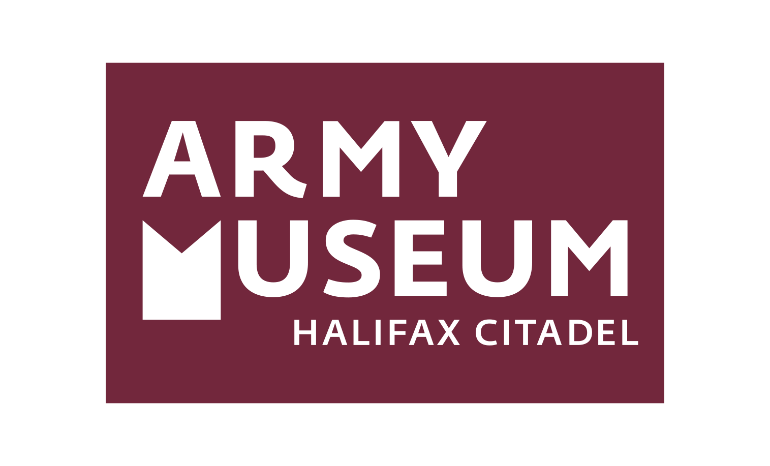
ARMY MUSEUM HALIFAX CITADEL LOGO
The visual identity and implementation for the Army Museum Halifax Citadel references the 5th Canadian Division’s two-inch-by-three regimental wool shoulder-patch.

THE 5TH CANADIAN DIVISION REINSTATES A COLOURED PATCH ON UNIFORMS
May 2014 saw the reinstatement of a coloured uniform patch, bringing the army back to its roots and a sign of respect for soldiers who fought in both world wars.

BRAND ASSETS
Two logos were developed, one for each official language. We also vectorized and reworked existing artwork to create a revised AMHC crest.

COLLATERAL
The logo was applied to various products, from postcards and rack-cards, to a self-directed walking tour program for the many World War l points of interest located in and around Halifax. Imagery focuses on the human side of war, and draw upon the Museum's rich collection of photography.

WEBSITE
We worked with the Army Museum Halifax Citadel to develop, design, and deploy a new AMHC website.
CREDIT
Photos (from top): [banner] © Parks Canada; [postcard] Army Museum Halifax Citadel; [parade square] WO Jerry Kean, LH2014-009-003, © 2014 DND-MDN Canada.